Vitinka mineral water
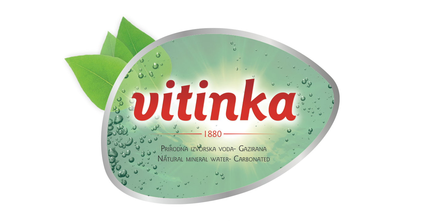
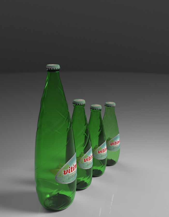
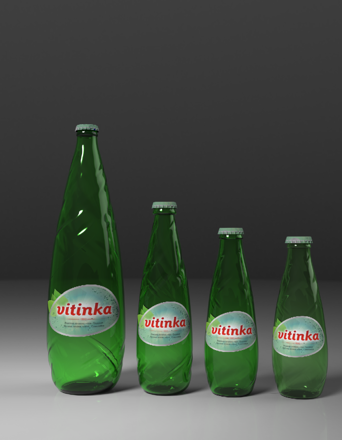
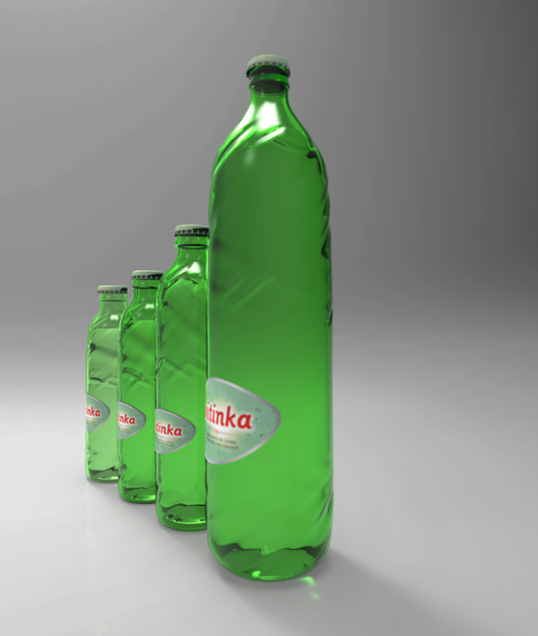
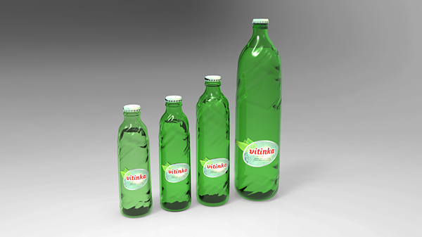
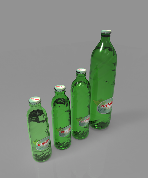
This is a suggestion for a redesign in packaging of the Vitinka mineral water, both the design of the bottles (1l, 0,3 l, 0,25l and 0,25l returnable), and of the label.
It was created as an entry in the student creative competition Cropak 2013.
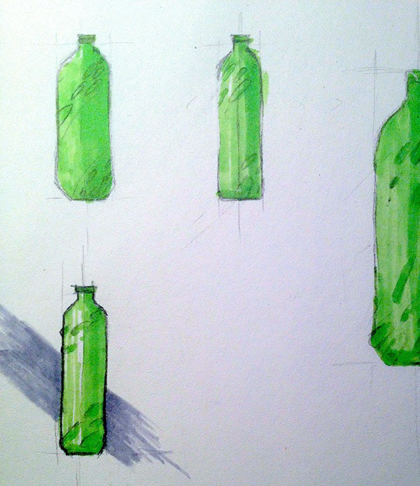
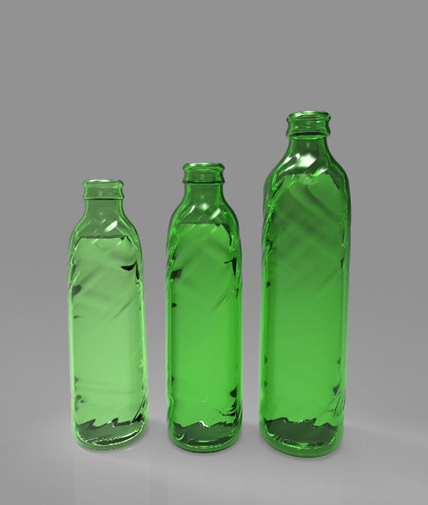
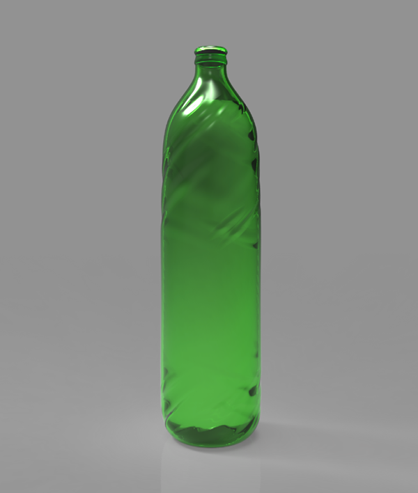
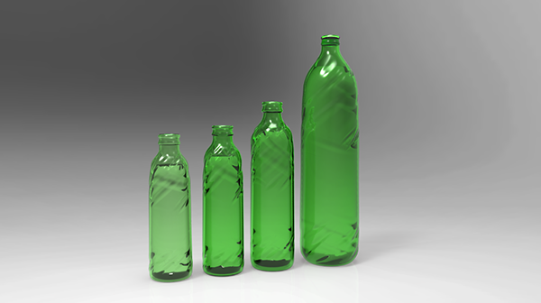
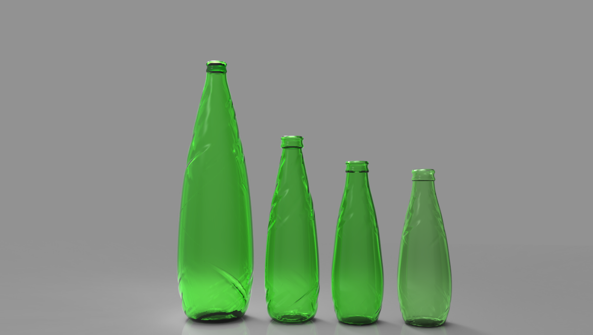
The direction this design was going for was to appeal to the younger, more urban customers, but also remaining number one mineral water with older population that is currently the main buyer of this water. Organic and modern shape of the bottle with subtle waves spiralling from the bottom to the top was combined with a irregularly shaped label to contrast the direction of the waves, evoking the image of a leaf in a stream.